
What is Break-even Chart? | Methods of Drawing
Under marginal costing, the details of break-even point are represented in graph ie break-even chart. The break-even chart is not only show break-even point but also indicates estimated profit or loss at varying levels of activity. There are three methods of drawing a break-even chart. These are explained one by one.
Table of Contents
Break-even Chart Drawing method 1
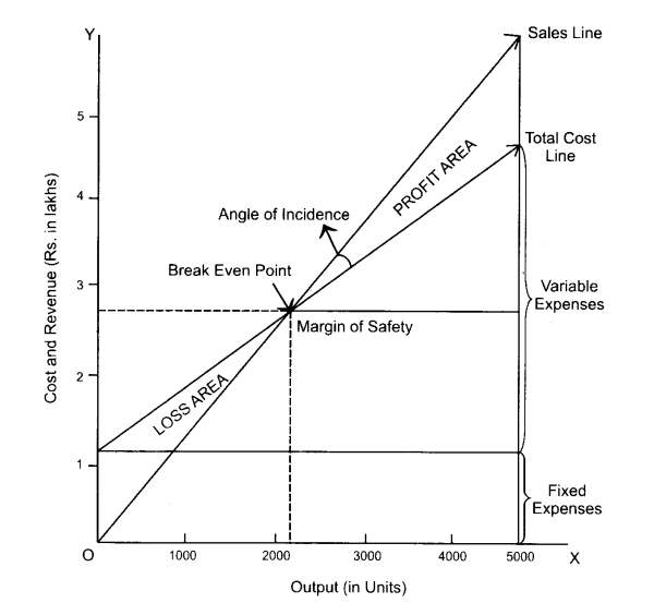
The fixed cost line is drawn parallel to X-axis. It means that the fixed cost remains constant at any volume of production. To draw the variable cost line, dots are plotted over the fixed cost line. It means that the variable costs are incurred over and above the fixed cost. The variable cost line is joined to fixed cost line at zero volume of production. Hence, this line is considered as total cost line. Sales values at various levels of output are plotted, joined and the resultant line is the sales line. The sales line will cut the total cost line where the total cost is equal to sales value i.e. break even point.
The number of units to be produced at the break-even point can be determined by drawing a perpendicular to the X-axis from the point of intersection. Likewise, the sales value at break-even point is determined by drawing a perpendicular to the Y-axis from the point of intersection. It is clear from the above break-even chart that if the actual production is less than the break-even point, the business is running at loss. Likewise, if the actual production is more than the break-even point, the business is running at profit.
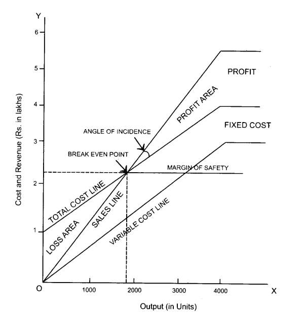
Break-even Chart Drawing method 2
Under this method, variable cost line is drawn first. This is the main difference between the first method and second method. After drawing variable cost line, the fixed cost line is drawn over and above the variable cost line. The later line is treated as total cost line and is drawn for various levels of output. This method gives much information to management for taking quality decision. The reason is that this method shows the recovery of fixed costs at various levels of production before profits are realized. Moreover, the break-even chart discloses the contribution at various levels of production.
Break-even Chart Drawing method 3
Initially, the fixed cost line is drawn parallel to X-axis as per the first method. Next, the contribution line is drawn from the 0 point and this line goes upwards according to the levels of production. Under this method, the contribution line cuts the fixed cost line in one place, which is the break-even point. It means that contribution is equal to fixed cost in the case of break-even point.
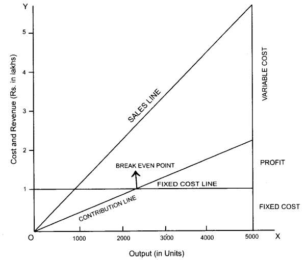
The excess of contribution over fixed cost is profit. If the fixed cost is more than contribution, it is a loss.
